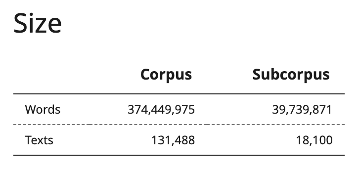
In Diachronic statistics section you can set the distribution, dates, and smoothing of frequencies. The specified parameters are applied to all graphs on the page.
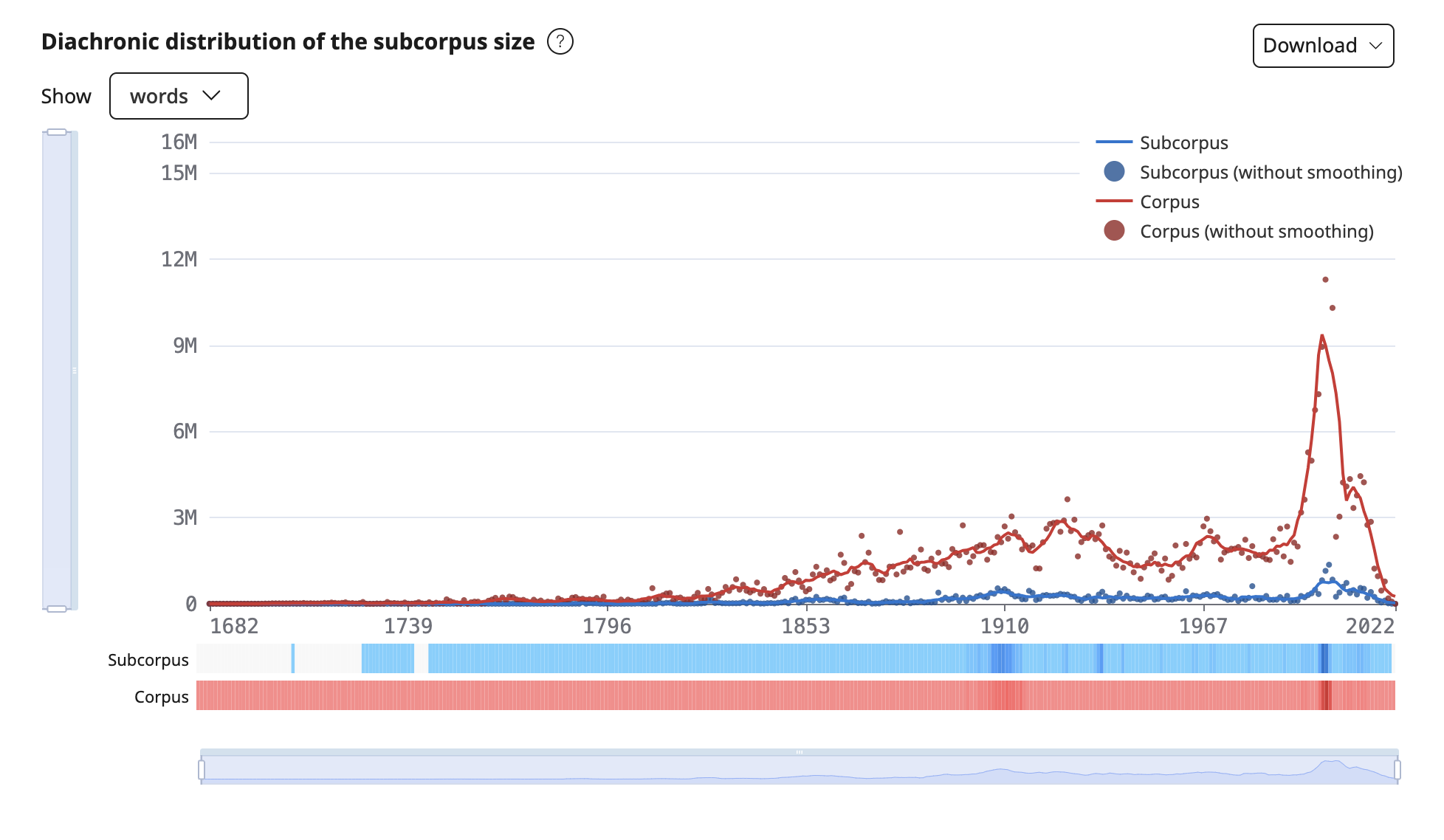
Diachronic distribution of the subcorpus size
Using the graph you can compare the distribution of subcorpus texts in comparison with the corpus over time. When you hover the mouse over the graph, you can see the number of texts or words in the corpus and the subcorpus with and without smoothing.

Beneath the graph you will find warming stripes, illustrating the number of texts in the corpus and the given subcorpus.
With the help of the windows for displaying dates and frequencies on graphs, you can zoom in or out certain sections of the graph, as well as navigate through the values on the axes.
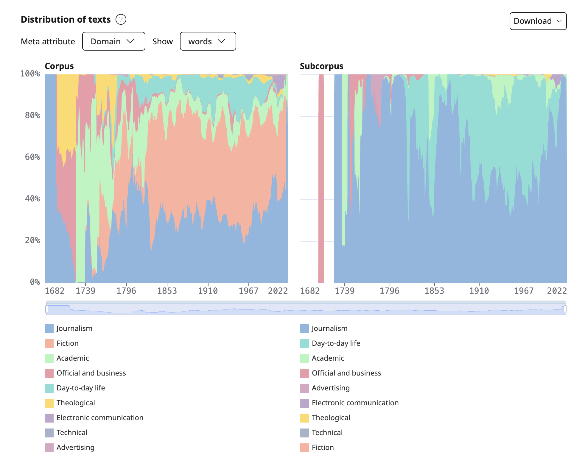
Distribution of texts
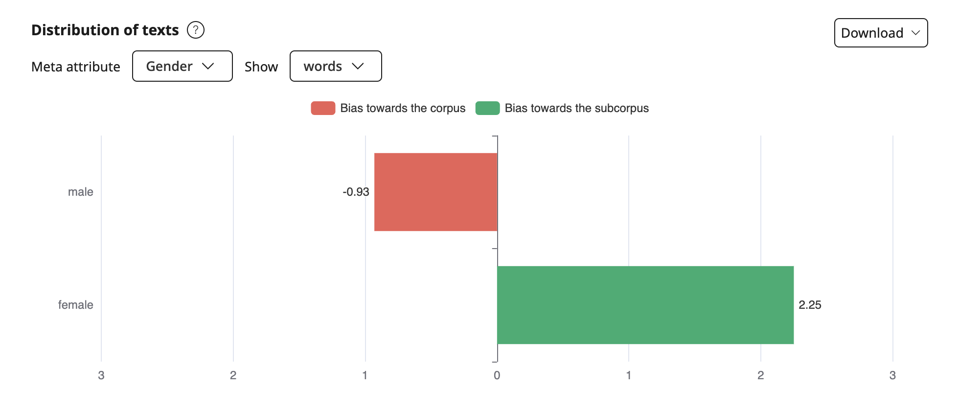
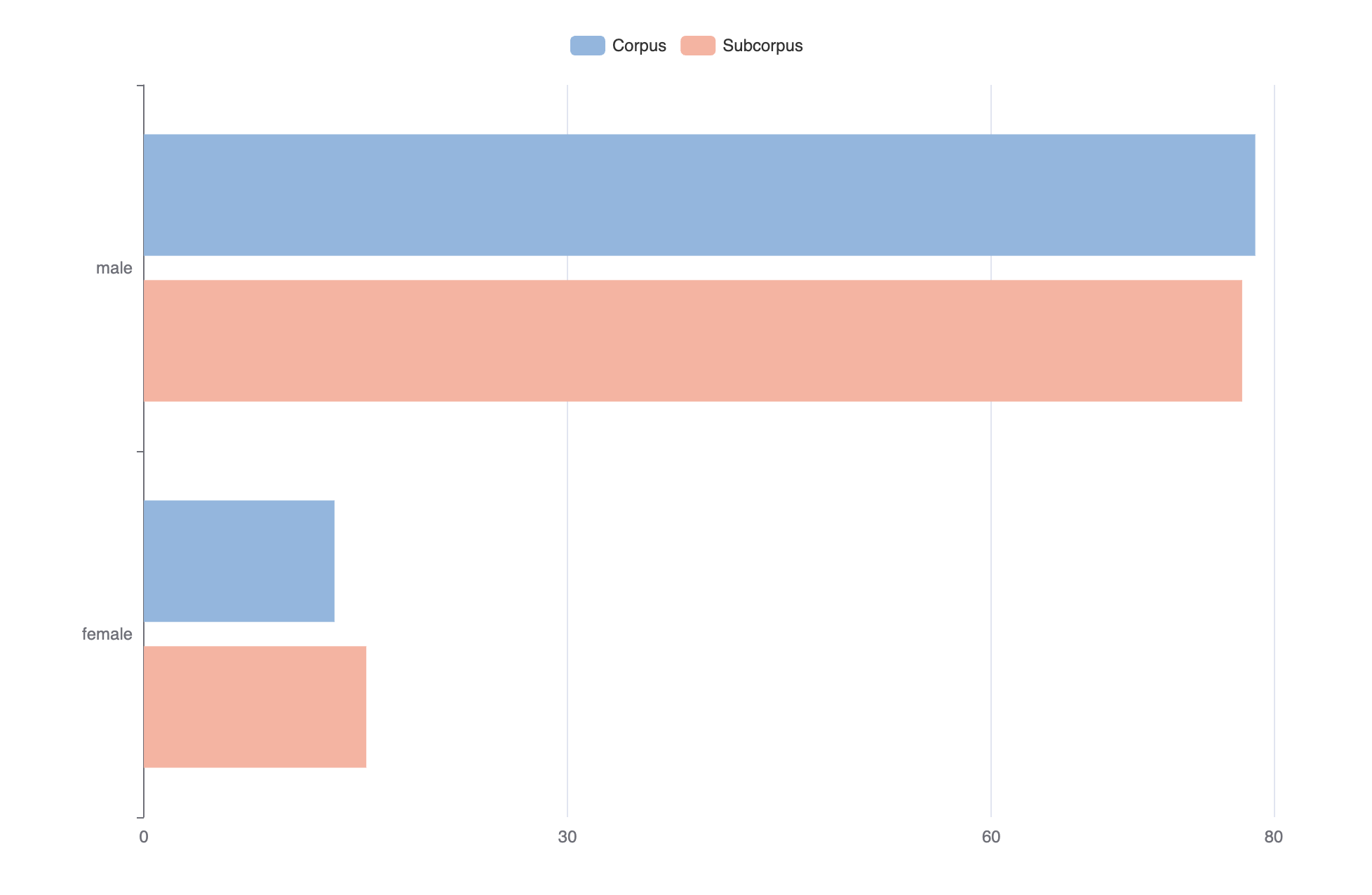
To compare the texts in the subcorpus and the corpus, two diagrams are shown. The user can select which meta attribute to build a diagram for from the list of the most significant attributes of the corpus, as well as the preferred unit of measurement (texts or words). When you switch the meta attribute and/or unit of measurement, the diagram gets redrawn.

To make comparison easier, the distribution of the top 10 values of the selected meta attribute in the subcorpus and their corresponding values in the corpus are calculated. The remaining values are merged into the Other category.
When you hover the mouse over the shaded area of the diagram, you can see the name of the value and the corresponding proportion and number of texts or words in the subcorpus and corpus. Using the "window" to display dates, which is common to both charts, you can also adjust the time period for a more in-depth analysis.
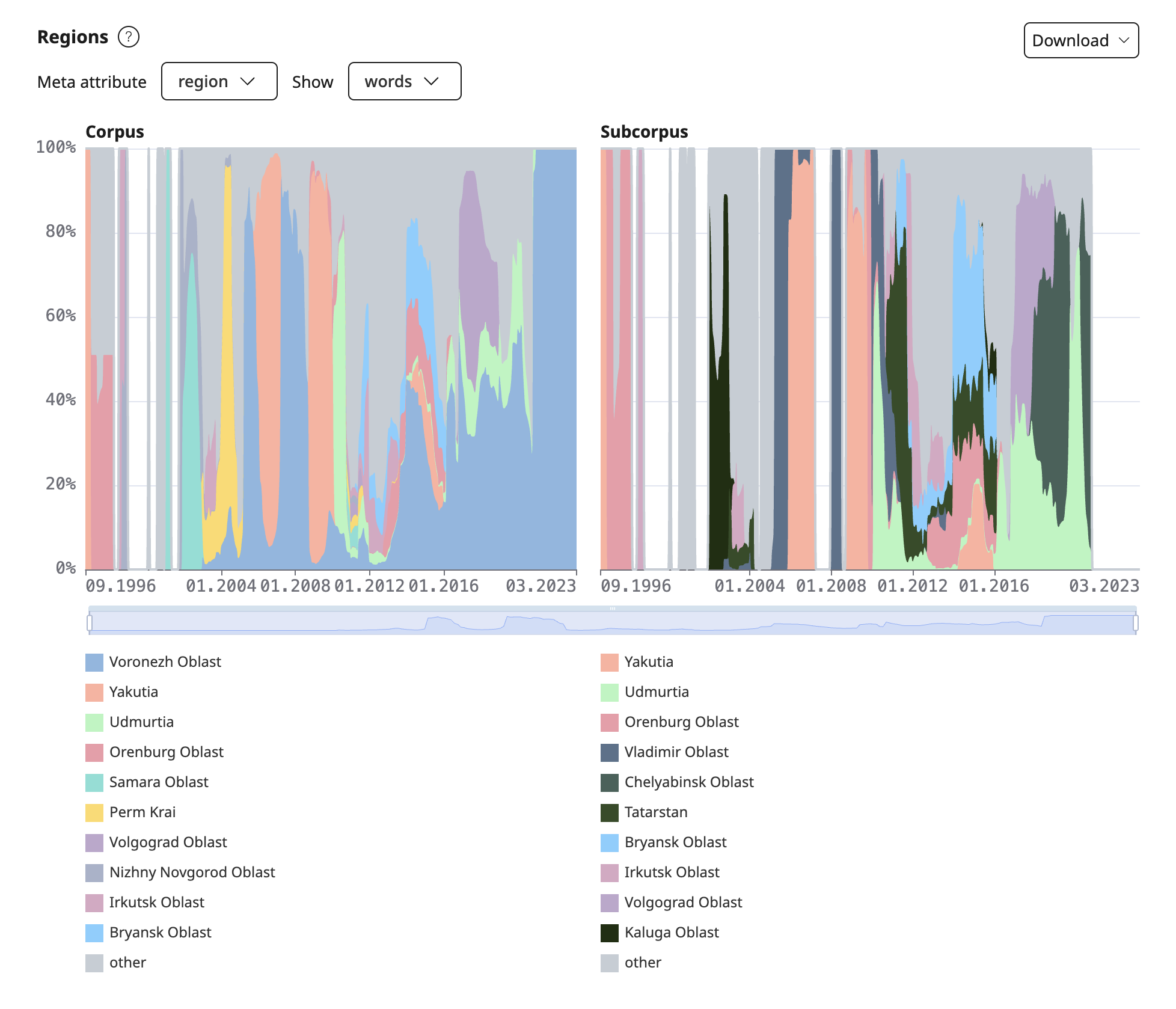
Regions
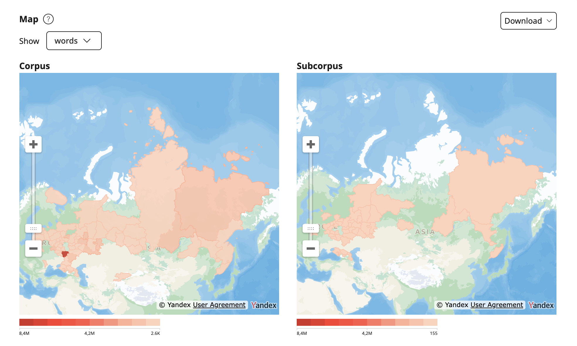
The graph shows the distribution of the texts in the corpus and the given subcorpus in the selected unit of measurement (texts or words) by regions. When you switch the meta attribute and/or units of measurement, the graph gets redrawn.

To make comparison easier, the distribution of the top 10 values of the selected meta attribute in the subcorpus and their corresponding values in the corpus are calculated. The remaining values are merged into the Other category.
When you hover the mouse over the shaded area, you can see the name of the region and the corresponding number and share of texts or words in the corpus and the subcorpus. Using the "window" to display dates, which is common to both charts, you can also adjust the time period for a more in-depth analysis.

