The graph illustrating the distribution of search results by date shows the frequency of occurrence of examples within a given subcorpus. In the graphs, the distribution and smoothing of frequencies are consistently calculated across the entire chronological span of the corpus. The user is presented with the segment of the graph delimited by the dates specified for subcorpus with smoothing set to 3.
You can set other dates within the subcorpus. To do this, enter new time boundaries—for instance, from 1900 to 2000. In the Regional Media corpus you can opt for a detailed view by day and month such as from March 1, 1920, to March 1, 1950. When you switch from the Regional Media corpus to another corpus, the graph will be plotted using years.
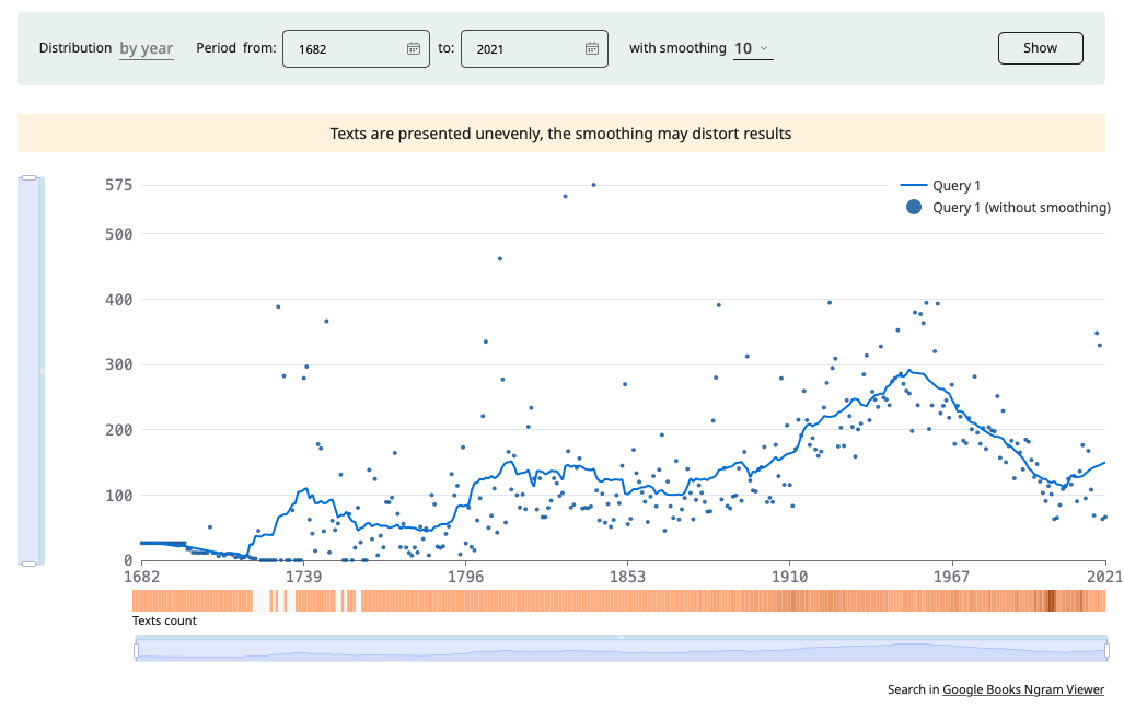
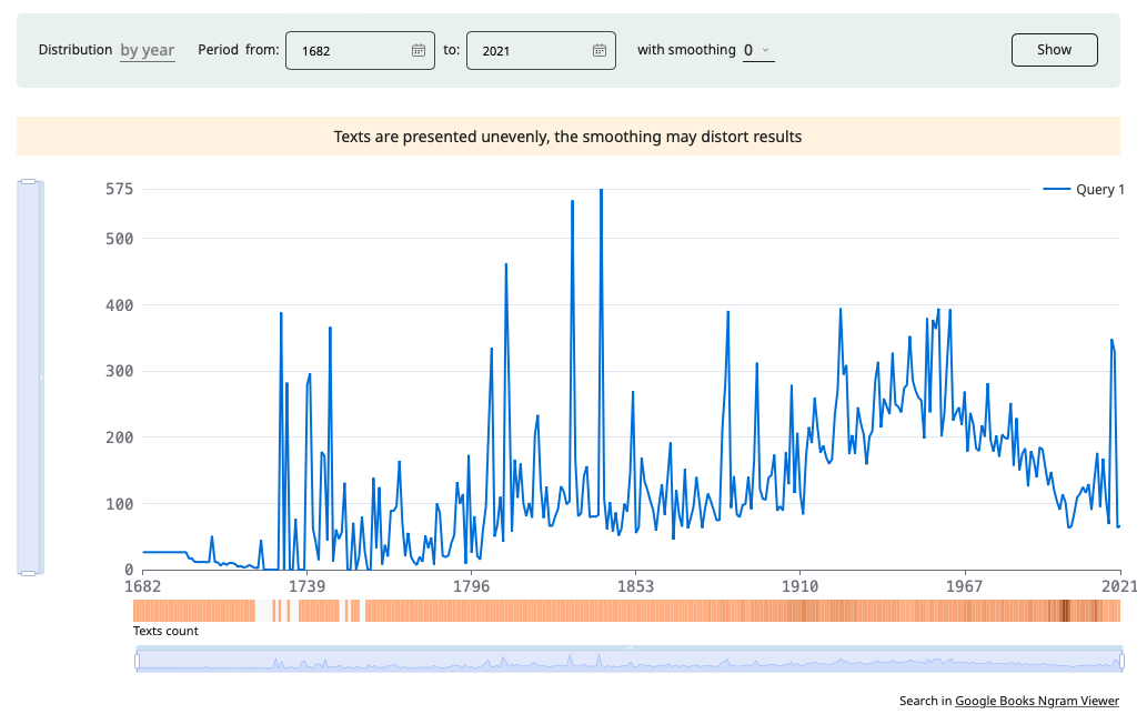
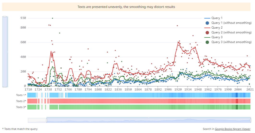
Smoothing the graphs enables you to discern the overall trend behind random frequency fluctuations. For example, smoothing at 10 years averages the frequency of a word over the preceding and following five years. To get accurate data for each date, set smoothing to 0.
Clicking the Show button generates the updated graph.
Hovering the mouse over any point on the line reveas the relative usage frequency for a specific date (ipm). The ipm frequency is defined as the number of occurrences of a word per date (e.g., per year) divided by the size of the corpus for that date and multiplied by one million.
With the help of the windows for displaying dates and frequencies on graphs, you can zoom in or out certain sections of the graph, as well as navigate through the values on the axes. This is useful when you have large amounts of data and you want to consider a narrower date or frequency range.
Click Download to save the graph as a picture file.
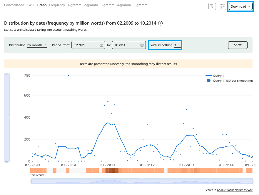
Below the graph, on the right, there is a link to the Google Ngram Viewer service, operating on the Russian-language collection of Google Books texts. Please note that, despite similar ideologies, the formulas for calculating relative frequency in the RNC and in Google Ngram Viewer differ.